The general nature of Q magazine is a very serious and ‘rock
and roll’. The mode of address is on the level of the readers, casual and knowledgeable
about the music industry. Q magazine sometimes uses slang or swear words which don’t
offend or shock the readers but gives that laid back sense to the ever serious
music industry – seen mainly on the contents page as that (from my chosen
magazine) holds the most text; for example, “Prince William was like a redneck” , giving the magazine an overall demographic of C2 to B.
In this particular issue “starring everyone”, artists of the century are
featured on the front cover, ranging from Dizzee Rascal to Paul McCartney. This
is likely because “100 of the greatest albums of the 21st century”
was recently released, Q and the artists will gain publicity through a
dual-promotion as the differing audiences will buy the magazine to see their
favouring artist and then, hopefully, research into the other artists as Q (a
well known and trusted company) has awarded them “artists of the century”. The
front cover is actually folded, as the line up is so large and worth three
pages long, this emphasising the importance of the artists and that the
magazine itself will be jam packed with unseen/heard detail and information for
the readers. Q’s tagline “The UK’s biggest music magazine” re-enforces this
idea of being full of the latest information.
Most of the artists on the front cover are giving direct
audience address, this is then creates the cool and serious qualities. Direct
address makes it more personal, as is the artists are looking directly at the
reader. None of the artists are smiling, reflecting Q’s brand image of serious ‘rock
and roll’. The house style on the pages add to the serious impression created,
as there are a lot of black and dark colours, giving connotations of mystery
and danger; all well as serious.
There is a quote from Noel Gallagher including swear words on
his double page spread, this shows that Noel is giving his honest opinion, of
which fans of the band and readers of the magazine will want to hear and read
further on about. The swearing also fits into the ‘rebellious’ image of both
the artists and that of the magazine. The serif font (usually used in a more
serious and formal medium) re-establishes that initial surprise when looking at
the page.
.JPG&container=blogger&gadget=a&rewriteMime=image%2F*)
.JPG)
.JPG)
.JPG)
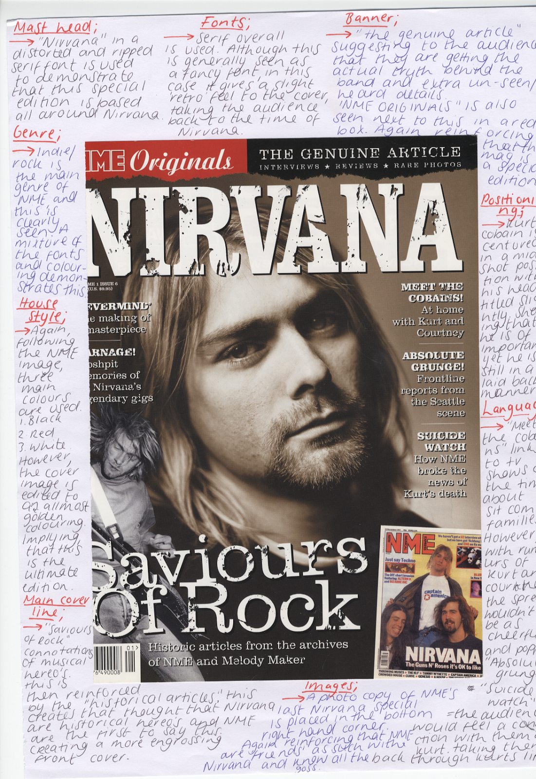
Analysis Of 'NME ORIGONAL' Nirvana edition


Analysis Of 'NME ICONS' Dave Grohl edition


