Friday 28 February 2014

Beginning Stages of my Pages

FRONT COVER

 
CONTENTS
 
 
DOUBLE PAGE SPREAD


My Original Pictures


Thursday 13 February 2014

Questionnaire - RMA

 
A mix of both males and females answered my survey, I did this as, although I am aiming for a particular sex as my target audience, I hope that both sexes would read it, and on the odd chance this may happen, I would like to know what both sexes think about my magazine and what they'd like to see come from it.
 
Feedback: I learnt that my logo is very well perceived by a wide audience and not just media students who are trained to pull apart the meaning of the logo. Many said that they layering represents the name, "stack" a stack of letters as it were. This means that the audience wont be confused by my work and can connect with it in a laid back manner, of which follows my magazines aims and style. Added to this, the audience members said they would also like to be involved in the creation of the magazine, and liked my ideas and motives to do so. A facebook page and an online version of the magazine with a chat room were the most popular answers selected.
The feedback also showed that a simplistic style is very efficient and draws the audiences eye. Due to so many magazine front pages being so full it can be distorting to the eye when submerged by others on the shelves of a shop.
 
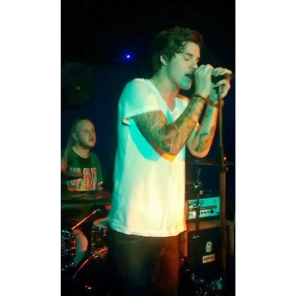
Overall the feedback was very positive, however, one negative was the sample front page of Q magazine I showed to them , I told them I was aiming to go along the same code and conventions as it and asked what their opinion on it was. The audience said that it didn't really fit what my magazine stands for, other than the colour scheme. For this reason I was be changing the close up shot of Brad Spectre on my front page to a more suitable and fitting photo. I also recently went to a local gig and was able to take pictures in a range of shots and angles and will be using these for my spread.
 
Here are two sample photos;


Tuesday 11 February 2014

Audeince Feedback on Test Shots

When asking my audience about my test shots I found that they were really interested in the general concept and idea of the double page spread. As my audience are of an age that are typically more interested in tattoos, they found it more insightful and ratable to read.

They also said it was very professional for me to take initiative and actually go to a studio and take the photos. However, they did mention that it may be hard to find a male model to be 'Brad Spectre' as he has tattoos and a certain look to him.

After some thought about this, I have decided to do a close up shot of 'Brad' for the front cover, this way neither his shoulders nor arms need to be on display; therefore creating the idea that he has tattoos. I found my inspiration for this from Q's Oasis special.


This image idea would also follow Stacks brand image; It is giving the audience an ability to share a relationship with Brad. In order for this to happen, eye contact will be made by Brad looking directly into the camera.

Test shots for my double page spread

"How my Tattoos tell my story"  

- Brad Spectre - 

For the photo shoot I went to a local tattoo parlour and took some photos (with permission of both the owner and the customer)
 
These are just some of the photos I am cosidering using for my final product.


My artist - Brad Spectre - A Preview To His Double Page Spread

Name: Brad Spectre

First album/EP: It's Lonely Here On Mount Olympus

Songs included:   Basement Eclipses
 
Billy the Sailor's Dream

Rapture

Strength in Fours

Biography: After his first EP climbed high on the ITunes chart ladder last year and his second currently being produced, Brad Spectre recently mentioned as Q’s “one to lookout for”, is a 19 year old indie artist from Oxford.


House Style update and note

Monochrome is very popular style at the moment, particularly with my target audience. However, as my magazine is two separate genre mixed together, I wanted to do spin on the simplistic black and white house style.

For this I still want to keep to the photo I put on my mood bored as I feel it gives that indie yet alternative spin on monochrome.


All though these colours are primarily for cars, I feel I Can make them work for the house style for my magazine. The colours are very mailable and link with what Stack offers.

Audience Feedback on my 'Stack' Pitch

Overall my audience feedback was very positive, they all said my name, logo and general design was very impressive.


Out of the two double page spread initial ideas, my second (the image to the left) was the most popular. 

My artist profile for Brad Spectre also proved very successful in my audience feedback. By creating such a detailed profile and even an EP "Its Lonely Here On Mount Olympus", it showed professionalism in my piece.

How I Could Increase Consumerism of My Magazine

In order for my magazine to be as successful as possible I need to be able to circulate my magazine efficiently through strategies such as;

  • USP = My readers will be included in the production stages of the magazine, therefore the magazine is literally "by the readers, for the readers". By simply creating a facebook page,twitter and even a cut out section at the back of the magazine, the audience will be able to voice their ideas and views.
  • Offers, promotions and competitions will entice the audience to by the magazine so they can then enter the competitions etc.. These will include such things as; "meet the artist", "win £200 to spend on iTunes", "Win a day trip to London" etc...